Introducing a rebrand for Woodlands Reclamation
The Client
Deliverables
Software
Date

The Challenge
Woodland Reclamation was a well-established organisation, but its visual identity lacked cohesion and failed to communicate the company’s unique values. Despite their strong focus on sustainability, reclaimed materials, and ethical building practices, their existing branding didn’t reflect this purpose or stand out. They needed a visual identity that would align with their mission.

The Process
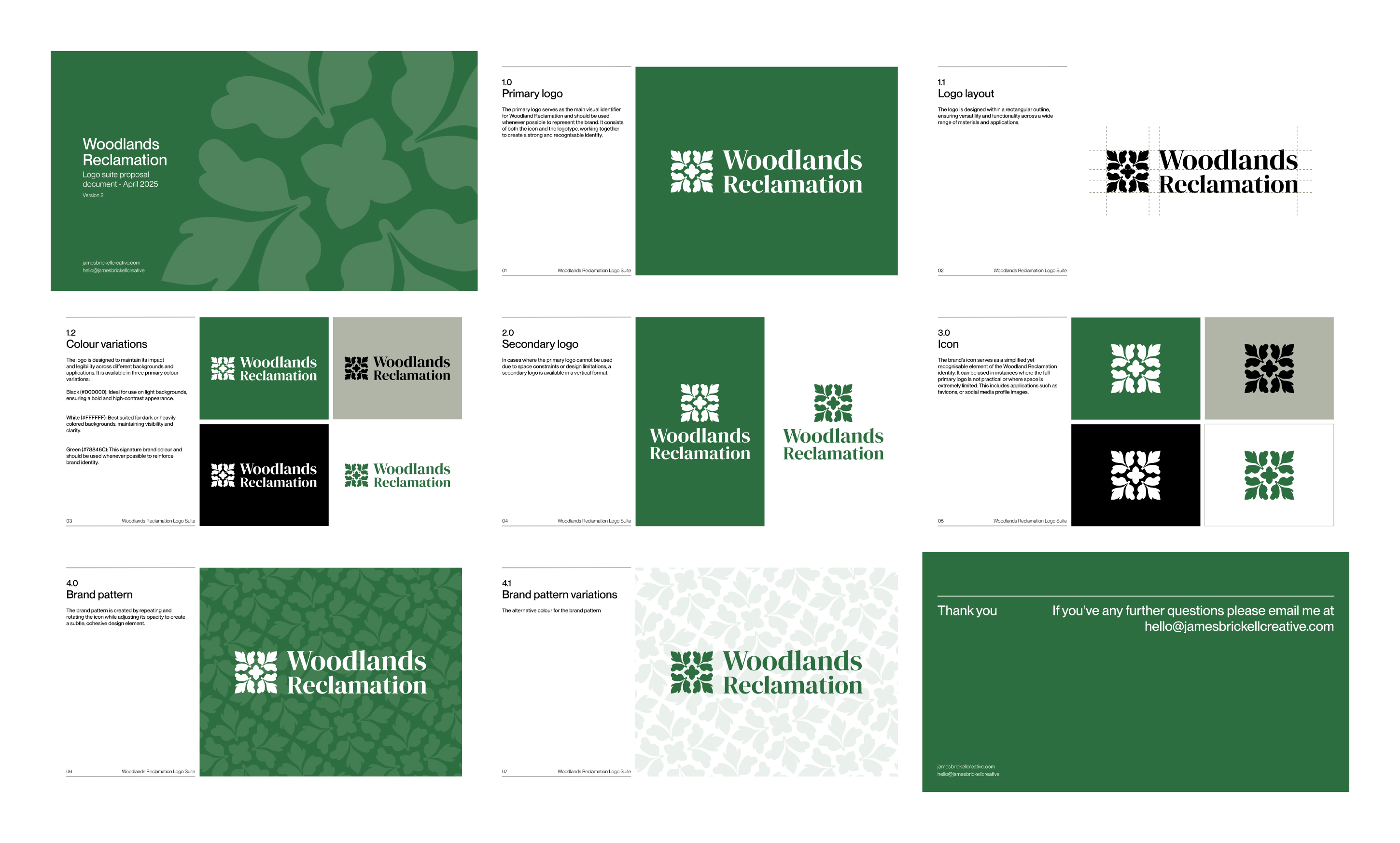
With no existing brand assets to build from, I began by developing a new icon that would serve as the cornerstone of the identity system. Inspired by tiling patterns commonly found in construction and landscaping, the icon references the company’s connection to sustainable building materials. This geometric form was designed with flexibility in mind. It could be used at various scales, function as part of a brand pattern, or adapt to different layouts across logo lockups.

Outcome
The final delivery included a complete logo suite, a comprehensive set of brand guidelines, and application mockups demonstrating how the system could be integrated across marketing materials. I also produced a set of point-of-sale (POS) visuals to help the client envision how the branding could be implemented in retail and signage environments.
.png)